 Our Work
Employee listening has never been easier.
Most organisations can launch a survey, collect thousands of responses and generate a dashboard in a matter of days.
Yet many still struggle to answer a simple question:
What should we do next?
The challenge isn't a lack of data. It's making sense of it.
Too often, employee listening platforms present scores without enough context. You can see that engagement is at 69%. You can see wellbeing scored 67%. You can see a department sitting below average.
But understanding why those scores exist is another story.
By the time you've clicked through multiple views, filtered different demographics and worked your way into the underlying questions, the insight is harder to find than it should be.
When dashboards create more work
Employee listening should help organisations move faster, not slow them down.
The reality is that many dashboards force users to choose between two extremes:
- High-level scores that are easy to understand but lack detail
- Detailed reports that contain the answers but take time to navigate
Neither is ideal.
Senior leaders need a quick view of what's happening across the organisation, while HR and People teams need confidence that they can dig deeper when required.
The best employee listening platforms shouldn't make you choose between clarity and detail.
They should give you both.
The problem with standalone scores
A score on its own rarely tells the full story.
Take an index such as Wellbeing, Belonging, Leadership or Growth.
Each score is built from multiple employee responses and experiences. It's not a single metric. It's a collection of insights rolled together to create a meaningful view of that area of the employee experience.
The score is useful.
But the real value sits underneath it.
Because that's where you find the employee perceptions, experiences and feedback that are actually shaping the result.
Without that connection, organisations risk focusing on the symptom rather than the cause.
Why we use lollipop-style charts
Employee listening data can get complicated quickly.
Dozens of questions. Multiple indices. Different business areas. Trend data. Benchmarks.
The challenge isn't collecting the data. It's making it easy to understand.
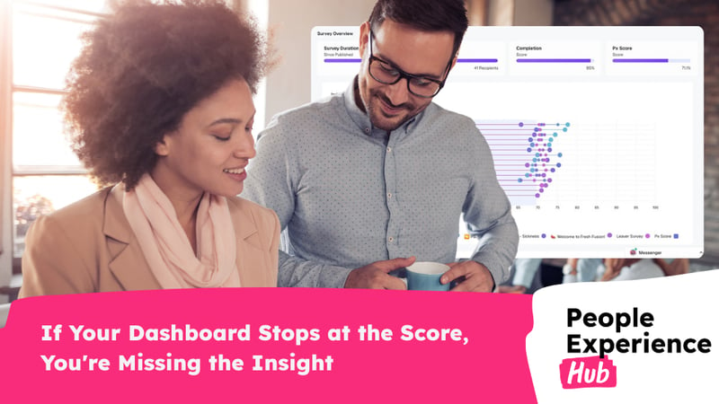
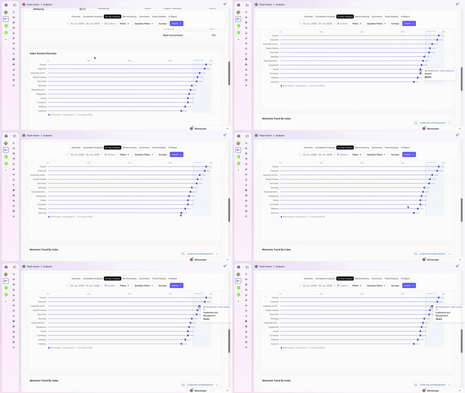
That's why we've designed our index scores using lollipop-style charts.
Unlike traditional bar charts, lollipop charts reduce visual clutter and make it easier to focus on what matters: the score itself. By removing unnecessary visual noise, users can quickly compare indices, spot strengths and identify opportunities for improvement.
At a glance, you can see:
- Which areas are performing well
- Which areas need attention
- How scores compare with your overall PX Score
- Where to focus your time first
This is particularly valuable for busy leaders and managers who don't have time to dissect complex dashboards but still need to understand what their people are telling them.
The score is just the starting point
A clear visualisation is useful.
But a score without context is still just a score.
Every index in People Experience Hub is built from a group of survey questions designed to measure a specific area of the employee experience, such as Wellbeing, Belonging, Leadership or Growth.
That's why our lollipop charts do more than display a number.
Hover over any score and you can instantly see the questions behind it.
No searching.
No jumping between dashboards.
No digging through reports.
Just a direct link between the score you're looking at and the employee experiences driving it.
That means users can move seamlessly between strategic insight and practical understanding.
You don't just know that a score is lower than expected.
You understand what's contributing to it.
Clarity without losing depth
Many employee listening platforms force you to choose between simplicity and detail.
Simple dashboards often lack context.
Detailed dashboards often overwhelm users.
Our approach is different.
The lollipop chart gives you a clean, high-level view of your results, while the hover functionality provides immediate access to the detail behind every score.
You can start with the signal, understand the story, and decide what action to take next.
Because effective employee listening isn't about collecting more data.
It's about helping people understand it.
Better insight leads to better decisions
When organisations can quickly connect outcomes to experiences, it becomes much easier to prioritise action.
Instead of spending time investigating where the issue might be, teams can focus on deciding what to do about it.
That has benefits for everyone:
- Leaders get clearer visibility of organisational performance
- HR teams spend less time navigating dashboards
- Managers gain more confidence in understanding their results
- Employees benefit from faster, more informed action
The result is a listening strategy that doesn't just generate insight.
It generates momentum.
Employee listening should be easy to explore
The purpose of a dashboard isn't to display data.
It's to make it easier to understand.
That's why the most effective employee listening platforms don't overwhelm users with complexity. They help people move naturally from signal to insight, and from insight to action.
Because seeing the score is only the start.
Understanding what's driving it is where the real value begins.
If your current dashboard stops at the score, you're only seeing part of the picture.
Discover how People Experience Hub helps organisations move from data collection to meaningful action with smarter visualisations, clearer insights and employee listening dashboards designed for decision-making.